Concept and Inspiration: Design Theory for Web Designers
Developing a meaningful concept is a crucial step in any design project... but it's a skill that few people really take the time to understand and appreciate. Today, Ahmed (UI Manager at Link Development and Adobe User Group Manager in Egypt) is going to walk us through the creation of a concept and inspiration process. We'll go through the process step by step, until we arrive at a successful concept to start our web design.
Why Developing a Concept Matters in Web Design...
In my last article, The Gestalt Principle: Design Theory for Web Designers, we established the need to start any design with the containing shell design first before going into the details, in this part we will discuss the methodology of coming up with a shell design.
Any containing shape should have a concept behind it - but sadly, lots of designers focus only on a nice-looking shape that really has no meaning behind it. Or worse, they design an entire website based on pre-existing frameworks without even a moment's thought for how an original design might bring some realmeaning to the project.
Truly great design has meaning behind it - it's not just pretty shapes, filters or typography - each element should actually say something about the underlying project.
At this stage, if you followed the methodology of creative requirements gathering (How to Get the Right Creative Requirements From Your Client), you should have enough input to build upon and work out what container shape or style your design will fit in.
Start By Collecting a Library of Reference Images
One of the easiest and simplest ways to find ideas is to have asked your client to give you some keywords to describe how he wants people to feel about his site.... energetic, fresh, young, solid....etc, by simply entering these keywords in any image search such as Google or Bing.
Choosing from these images the ones you like, you will easily find yourself with a large library of brainstorming ideas to start from.
Design Begins With a Brainstorm
Similar to any brainstorming exercise, don’t dismiss any ideas... however strange they are. It’s always easier to tone down a design than to try and spice it up… sitting down in front of your library of ideas, get a pencil and paper (which are excellent tools at this stage) and start sketching out concepts that come to your mind by looking at your library, sketching helps because ideas tend to fade away as fast as they pop into your mind :)
For example, if a client asks me for a “fresh” design, I will simply enter “fresh” in Google for example (or your preferred search engine) and checkout the image results.
Here is a sample of what I came up with:

How would these images inspire me? What would they tell me about the direction of the design?
Well, simply knowing that my client wants a fresh design and by using this method in interpreting the images I would understand that:
I should mostly go for organic or curved shapes
Light “fresh” color shades are preferred (more on color in a later article)
Use of “crystal” style and semi-transparent components.
Have a lot of white space and no over-crowding of components
I usually prefer to do this exercise with 2 or 3 other designers together as it helps bounce different ideas off each other, I would ask each one to search for images alone for 15 or 20 min, then sit together and start saying what we see in each image, you will be surprised how other people may see something totally different than what you think or see, and this may open up a totally new idea for you.
It's important to talk during this stage in the design process! The word "fresh" means different things to different people - so don't rely solely on the initial search of image results or your own interpretation to be the definitive source of inspiration.
Don't Copy Ideas, Steal Them!

Good artists copy, Great artists steal,
- Pablo Picasso (1881 – 1973)
My interpretation for this quote is this: Copying another idea will make you a good designer, however, “stealing” an idea or concept from within another design and using it wisely (without blatant copying) will make you a great designer.
Stealing an idea is hard - much harder than copying - you need to truly understand the concept to lift it from one place and move it into your design.
Case Study: Stealing the Pyramids
In a recent project, I was working with a team on a site for an Egyptian Tourism portal. They did not want a straight forward “Pyramids, Karnak, Pharaonic” style site that most people would go for... They wanted something modern, yet they wanted to keep an Egyptian identity that would literally say “this site is from Egypt”.
It was a real challenge, but by going through the above methodology we came up with images like these:

Now the client didn’t want cliché designs showing straight forward hieroglyphs or images of ancient Egyptian temples and stuff like that, but by looking at the images we started building on the idea that we can use some elements such as the slanted walls and the ancient Egyptian portals and how they would relate to the site being a portal to Egypt.
The problem is that the only style that's unique to Egypt is Pharaoh-style. If we went with Arabian art, for example, it would not be unique to Egypt. If we show diving or beaches, it is not unique. If we go with any other style, it will not be unique to Egypt and that was a strict requirement.
At the same time, we were told not to use clear Ancient Egyptian images or hieroglyphs as the client wanted to promote all types of Egyptian tourism, not just temples or pyramids. A tricky design brief, to be sure.
In the end we came up with a sketch like this:

We simply took part of the entrance “portal” pylons in Karnak temple, using only the slanted lines to identify the walls, the area in the middle was used to animate different images from Egypt and we used the left area for the logo and navigation while the whole right area was used for the content.
It was a very simple concept, yet it fulfilled all the requirements. Such an idea would have been hard to come to mind if we had not watched the photos and images that came up from a simple “Egypt” search query.
We were able to steal the ideas behind the Karnak Temple and the Pyramids, and then use them in our design.
Good Concepts Speak For Themselves
Some people argued that this concept may not be very clear when people look at the site, and this may seem strange, but concepts don’t need to be “understood” from first look at a design... nor do they need to be visually clear at all – this is not a must. This may be easily understood by looking at logos, take the Mercedes logo for example:

At first glance for most people, it is just a 3-pointed star. However, the concept behind this star is that it represents its domination of the land, the sea, and the air – having the top arm representing the air and the 2 bottom arms representing land and sea.
Who knew? Very few people outside of the company... but that's not the point, now is it? A good concept speaks for itself - even if people don't immediately understand exactly what it means, the intentional shapes and ideas underneath will always take on a life of their own. Concept-less designs don't have that kind of life... they just sit there.
Finding Inspiration for Concepts
Another great source of inspiration is to try and stay away from your screen. Many designers tend to visit design inspiration sites, which contain daily top designs. While this is a good exercise in other phases (such as requirements gathering and in component details), it probably won't help much when you’re trying to come up with your own core concept.
It’s often better to look at other off-screen sources – Billboards, Magazines, Posters and TV Commercials are very good sources if you have time, especially because the rules governing web design differ greatly from print design or TV Ads, they give you a unique perspective that help you come with up with very original ideas that you can work into your design concept.
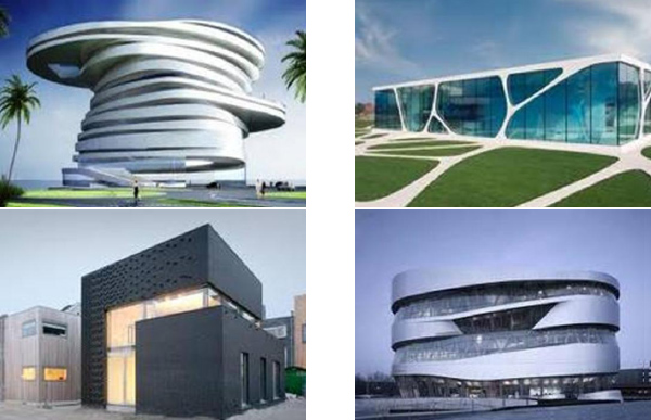
Architectural designs also can be good and unique sources of inspiration:

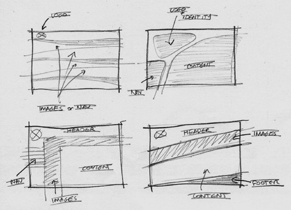
Depending on your client and your goals, each of the above buildings can give you new concepts and ideas to use for your web site “container shell” design as in the following examples (in the same order):

Notice how each of the architectural photos from above can easily be turned into viable website shell designs.
The trick is to always keeps your eyes open and use everything as your source of inspiration, don’t narrow down your options by sticking to looking only at other web designs or trying to come up with something on your own.
Conclusion
Seeing comes before words. The child looks and recognizes before it can speak.
- John Berger, Ways of Seeing
If you haven't come across John Berger's, Ways of Seeing, it's worth finding a paperback copy (or at least an e-book version!). I won't dig too deep into the details, but it's a book that explores the ways that people see the world around them. The underlying message is that seeing is a vital and primal instinct to us humans - we "see" before we read, before we speak, and before we walk.
As such, we as web designers can take some special meaning from this truth. We should be careful to craft the concepts behind our designs because they are the first thing that people "see". Before the words on the page or the flashy image slider that we've been working so hard to code, people see the shell - the concept - that creates the overarching impression of the site. Details are important, don't get me wrong, but you can't really nail the details until you've got a meaningful design to put them into.
You must Sign up as a member of Effecthub to view the content.
A PHP Error was encountered
Severity: Notice
Message: Undefined index: HTTP_ACCEPT_LANGUAGE
Filename: helpers/time_helper.php
Line Number: 22
Latest Posts
- How to Become a Conversion-Centered Designer
- Concept and Inspiration: Design Theory for Web Designers
- St. Mary’s ranks high on video game design programs
- How to become a game designer
- Flappy Bird developer says he took down game because it was addictive http://www.latimes.com/business/technology/la-fi-tn-flappy-bird-developer-addictive-20140211,0,7518016.story#ixzz2tHiTutkF


1558 views 0 comments
You must Sign up as a member of Effecthub to join the conversation.